Introducing Friendly Center’s New Logo
In the Fall of 2019, as we anticipated the beginning of a new decade, it was decided that Friendly Center’s logo needed a fresh start too. We took the opportunity to thoughtfully create a logo that better reflects our work in and commitment to the community.
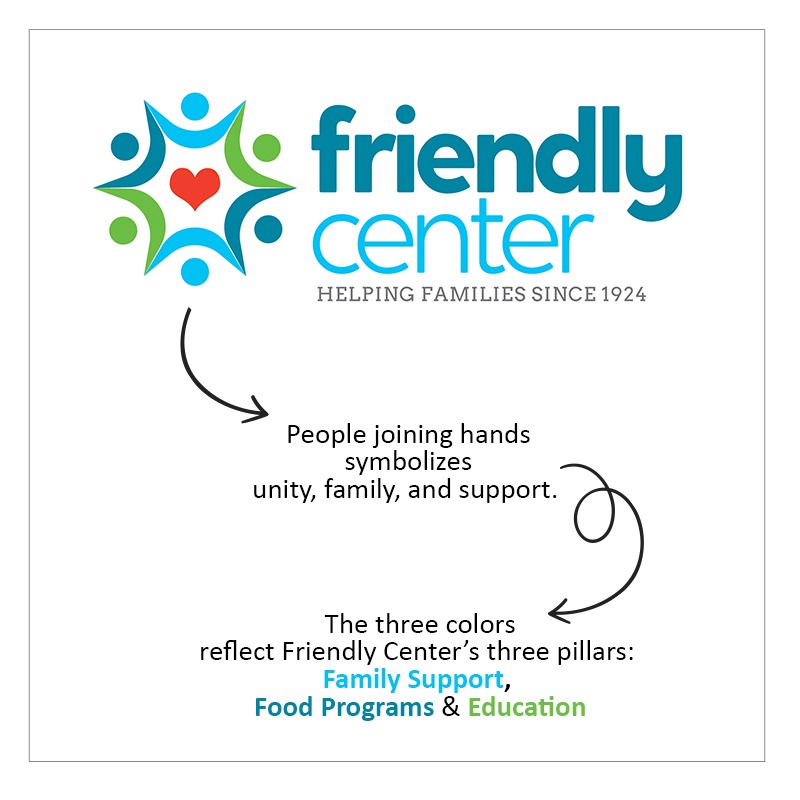
The group of people holding hands around a heart represents our wraparound services, with the colors being representative too; each one reflecting one of Friendly Center’s pillars: Family Support (blue), Food Programs (green), and Education (light blue). The logo’s modern font style reflects one of Friendly Center’s greatest strengths; our ability to adapt programs and services to meet the current, modern needs of the community. While our tagline anchors us in our history of helping families since 1924.
Love It!!!!
Love the new look!